Posted by Bob Lord
If you don't believe inequality is our most daunting challenge, check out this chart from the Pew Research Center, reported in today's Huffington Post:
Explanation follows after the jump.
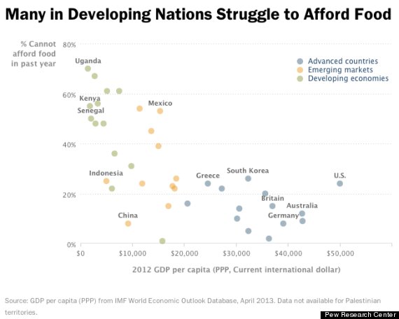
The chart shows an obvious negative relationship between a country's per capita income (GDP) and food insecurity, measured by the percentage of people struggling to put food on the table.
Draw a line from Uganda at the top left to Germany at the lower right. That line reflects the overall relationship. Most countries fall somewhere close to that line. The higher their per capita income, the lower their food insecurity.
Those countries that fall far from the line are outliers. The ones far below and to the left of the line, like China, are outliers in a good way. They have less food insecurity than would be predicted based on their per capita income.
The one, and there's only one, far above and to the right of line, is an outlier in a really bad way. It has far more food insecurity than a country with its per capita income should.
And there we are, in our class by ourselves, in a very ugly way.
In fact, if you take that trend line and extend it out to the point where it intersects our $50,000 per person income, we really should have no food insecurity at all. Certainly, we should have less than any other country, yet we have twice the percentage of people struggling to put food on the table as some other, poorer, countries.
This is shameful.
Discover more from Blog for Arizona
Subscribe to get the latest posts sent to your email.