A lesson from history on the failure of GOP ‘trickle down’ economics

Republicans control the White House, both chambers of Congress, the tilt of the Supreme Court, more state legislative chambers than any time in history, and more governor’s offices than they have held in nearly a century. Republicans Expand Control in a Deeply Divided Nation.

This is the GOP’s high-water mark since 1929 — just before the Great Depression that GOP laissez faire economic policies brought about.

Historian Robert S. McElvaine, the author of “The Great Depression: America, 1929-1941,” warns at the Washington Post, I’m a Depression historian. The GOP tax bill is straight out of 1929.

“There are two ideas of government,” William Jennings Bryan declared in his 1896 “Cross of Gold” speech. “There are those who believe that if you will only legislate to make the well-to-do prosperous their prosperity will leak through on those below. The Democratic idea, however, has been that if you legislate to make the masses prosperous their prosperity will find its way up through every class which rests upon them.”

That was more than three decades before the collapse of the economy in 1929. The crash followed a decade of Republican control of the federal government during which trickle-down policies, including massive tax cuts for the rich, produced the greatest concentration of income in the accounts of the richest 0.01 percent at any time between World War I and 2007 (when trickle-down economics, tax cuts for the hyper-rich, and deregulation again resulted in another economic collapse).

Yet the plain fact that the trickle-down approach has never worked leaves Republicans unfazed. The GOP has been singing from the Market-is-God hymnal for well over a century, telling us that deregulation, tax cuts for the rich, and the concentration of ever more wealth in the bloated accounts of the richest people will result in prosperity for the rest of us. The party is now trying to pass a scam that throws a few crumbs to the middle class (temporarily — millions of middle-class Americans will soon see a tax hike if the bill is enacted) while heaping benefits on the super-rich, multiplying the national debt and endangering the American economy.

As a historian of the Great Depression, I can say: I’ve seen this show before.

Read more

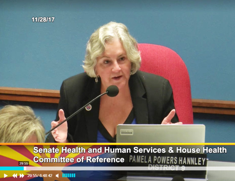
Rep. Pamela Powers Hannley

Inequality, Access to Care & Workforce Development: Legislative Update at DGT, Dec 4

Economic Inequality, Access to Care & Workforce Development will be the focus of my Legislative update at the Democrats of Greater Tucson Meeting on Monday, December 4. Come on down and hear how Arizona could lessen economic inequality and improve access to care while developing new career paths. Also, hear about new legislation being proposed … Read more

New Census Bureau data on median household income

Permanent musical accompaniment to this post: Party Like It’s 1999.

The median income for U.S. households is now slightly higher than what the median income was for households . . . in 1999. Americans are finally making more money than we were in 1999:

Adjusted for inflation, median household income rose to $59,039, which is up 3.2 percent from 2015 to 2016, according to Census Bureau statistics. The previous highest median income, the Associated Press reported, was $58,665, which was recorded in 1999.

Screen Shot 2017-09-15 at 1.34.27 PM

It took 18 years, but the American median income is finally back to where it was before the 2001 recession.

The report covers the final year of the Obama administration, in which poverty rates also decreased from 13.5 percent to 12.7 percent. In real numbers, that’s a drop of 2.5 million people, according to USA Today. The number represent the first time since the recession that the rate wasn’t higher than levels prior to the recession.

In a year filled with debate on health care, the amount of Americans who have health insurance increased by 900,000 to 28.1 million, and the percentage of Americans not covered by insurance dropped from 9.1 percent to 8.8 percent.

Read more

Jared Bernstein: The whys of increasing inequality

I posted about this chart last week, Inequality in One Chart, and our “usual suspects” posted their utterly nonsensical defenses of faith based supply-side “trickle down” GOP economics in the comments.

Today, economist Jared Bernstein weighs in at the Washington Post, The whys of increasing inequality: A graphical portrait:

The graph below, based on the work of economists Gabriel Zucman, Thomas Piketty and Emmanuel Saez, has been receiving considerable attention since it appeared in the New York Times last week. It shows the rate of annual income growth for adults at each percentile in the income distribution — from those who have the lowest incomes to those who have the highest incomes — over two time periods: the mid-1940s to 1980, and 1980 to 2014. Over the first period, post-tax income growth was fastest at the bottom, about 2 percent per year for the “middle class” (the 40th to the 80th percentiles), and a little slower among the wealthy.

Screen Shot 2017-08-09 at 7.50.09 AM

The growth pattern over the second 34-year period looks very different: The richer you were, the faster you got ahead. Incomes grew less than 1 percent for the bottom 50 percent and less than 2 percent for the next 45 percent. They then took off for the richest Americans, with the growth rate for the richest adults ending up about six times that of those in the middle.

The chart is a clear, intuitive way to show the increase in income inequality over the past few decades, and an important reminder that growth for the rich cannot be expected to trickle down to everyone else.

But it doesn’t show why inequality has grown. What explains this portentous change, one that has had profound effects on our society, our living standards, and our politics?

In fact, there are many perps, each of which is captured in the “Inequality’s Causes” slide below. They do, however, share a theme: Many of the factors that enforced a more equitable distribution of growth in the earlier period have been eroded. Moreover, that erosion is neither an accident nor the benign outcome of natural economic evolution. It is often the result of policies that have reduced workers’ bargaining power and supported the upward redistribution of growth.

Screen Shot 2017-08-14 at 6.23.36 AM

Read more

Inequality in One Chart

David Leonhardt of the New York Times reports on the latest research from Thomas Piketty, Emmanuel Saez and Gabriel Zucman. Our Broken Economy, in One Simple Chart:

Many Americans can’t remember anything other than an economy with skyrocketing inequality, in which living standards for most Americans are stagnating and the rich are pulling away. It feels inevitable.

But it’s not.

A well-known team of inequality researchers — Thomas Piketty, Emmanuel Saez and Gabriel Zucman — has been getting some attention recently for a chart it produced. It shows the change in income between 1980 and 2014 for every point on the distribution, and it neatly summarizes the recent soaring of inequality.

Screen Shot 2017-08-09 at 7.50.09 AM

The line on the chart (which we have recreated as the red line above) resembles a classic hockey-stick graph. It’s mostly flat and close to zero, before spiking upward at the end. That spike shows that the very affluent, and only the very affluent, have received significant raises in recent decades.

This line captures the rise in inequality better than any other chart or simple summary that I’ve seen. So I went to the economists with a request: Could they produce versions of their chart for years before 1980, to capture the income trends following World War II. You are looking at the result here. [Interactive graphic – see the article.]

The message is straightforward. Only a few decades ago, the middle class and the poor weren’t just receiving healthy raises. Their take-home pay was rising even more rapidly, in percentage terms, than the pay of the rich.

Read more